Duke Energy Renewables Renaming & Rebranding
Deriva Energy

Odgis + Co renamed and rebranded Deriva Energy, formerly Duke Energy Renewables — a company recently acquired by Brookfield Renewable. The name is based on the word derivation, which means “the obtaining or developing of something from a source or origin.” Deriva suggests renewable power and national reach.
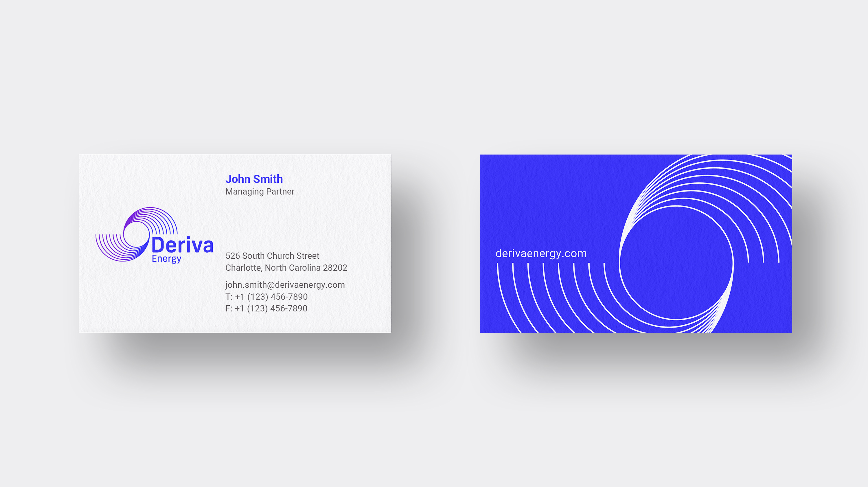
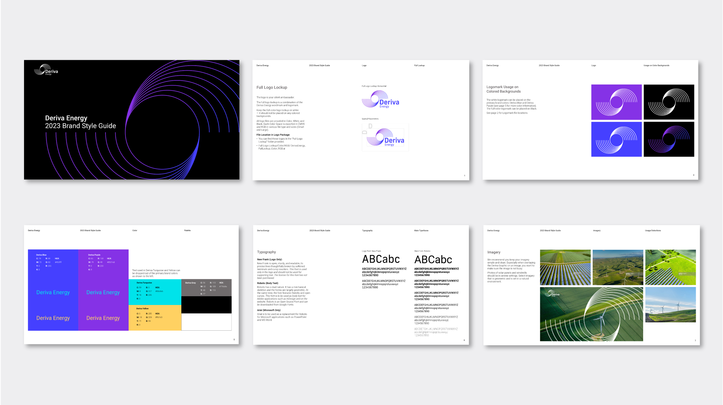
The logomark represents both solar and wind energy. The round lines suggest the swirling propeller of the wind turbine, and the negative space of the circle implies the sun. The wordmark’s typographic form also reflects circular energy, radiating with power. The brand colors are a gradation of two vibrant purples blending into each other. These colors help to differentiate Deriva Energy from the other companies in the renewable energy arena. We designed The Brand Style Guide and asset templates to ensure the longevity of the design system.
Read more about the rebrand on PR Newswire and Renewables Now.
"Thanks to everyone at Odgis + Co for the fine work! The brand and logo look amazing"
Richard A. Mahony, Corporate Communications | Brookfield Renewables


RELATED WORK

Eurasia Group
Eurasia Group Rebranding

Odgis + Co
When Me Becomes We Animation