Designing Ralph Ellison’s Invisible Man
Ralph Ellison wrote of the struggle to make Black Lives Matter in his 1952 classic Invisible Man which is 19th on the list of the 100 best English-language novels of the 20th century.
“I am invisible, understand, simply because people refuse to see me. Like the bodiless heads you see sometimes in circus sideshows, it is as though I have been surrounded by mirrors of hard, distorting glass. When they approach me they see only my surroundings, themselves or figments of their imagination, indeed, everything and anything except me.” Ralph Ellison
It is said that you can't judge a book by its cover. As a designer of book covers I hope that is not entirely true. Just as a screenwriter must condense a novel into a two hour movie, my job is to turn an entire book into a single cover.
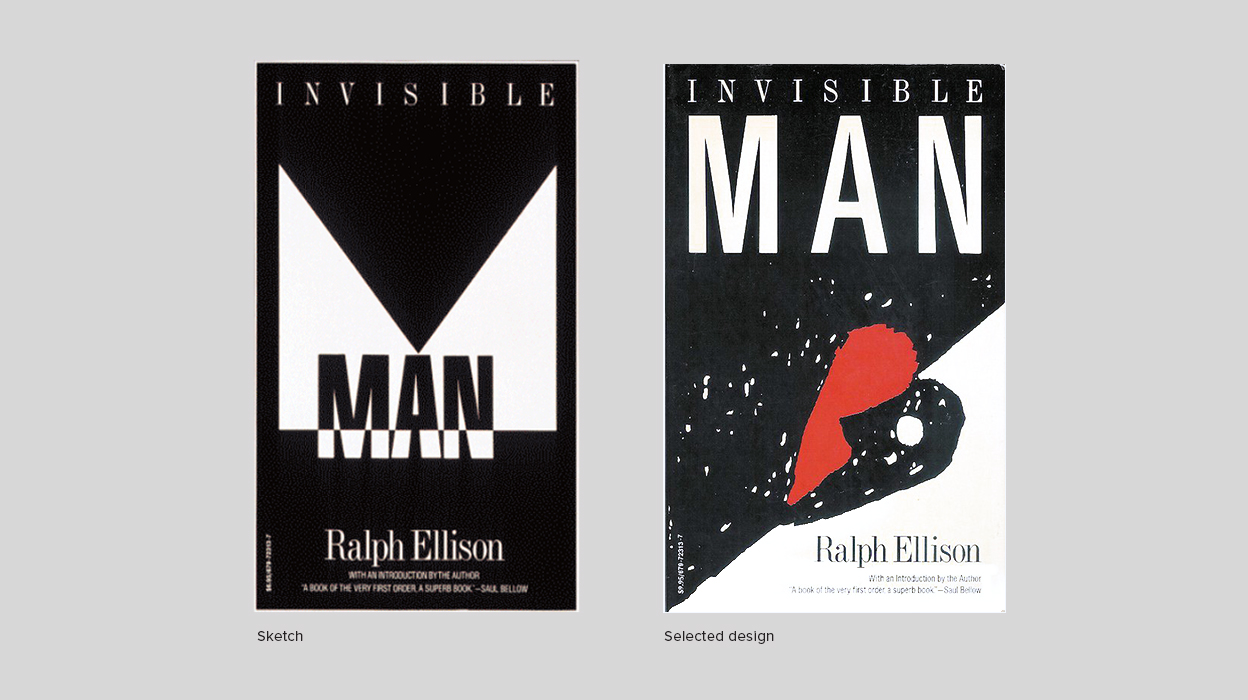
When I started Odgis + Company, one of my first projects was to redesign a series of modern classic book covers for the publisher Vintage, who was re-releasing multiple books. One of these covers was for Ralph Ellison's Invisible Man. It addresses many of the social and intellectual issues faced by the African Americans in the early twentieth century, as well as issues of individuality and personal identity. The struggle is still going on today. It’s haunting, shocking, sad, and unforgettable.
I designed Invisible Man more than 30 years ago and after recently rereading it, I continue to be amazed by the brilliant, timeless writing of Ralph Ellison. It’s a formidable responsibility to create a cover design to represent this masterpiece and I am honored to have had that opportunity.
I always started by reading the books, thinking about their essential message, then finding a visual expression. My goal was to entice prospective readers to pick them up. The challenge was to create a visual language—a visual voice—that would accomplish this goal.
Because the customer might only look at the cover for an instant, the designer must convey the essence of the story clearly. With that daunting task, I decided to take a minimalist approach to designing this cover. I endeavored to extract the energy of the story to explore ways to express the oppressive, toxic forces that were disillusioning this innocent man and causing his life to spin out of control. I incorporated typographic forms in stark black and white, using them as abstract visual shapes. The visual tension is created by the juxtaposition and relationship of these forms. I always present more than one idea, and the chosen design in this case was an enlargement of my doodle. It was selected as one of the 25 of the Best Covers for Ralph Ellison’s Invisible Man.
By Janet Odgis
Read this article on LinkedIn.
Odgis + Co is an award-winning brand design studio based in New York City. We Make Business Beautiful.
“I am invisible, understand, simply because people refuse to see me. Like the bodiless heads you see sometimes in circus sideshows, it is as though I have been surrounded by mirrors of hard, distorting glass. When they approach me they see only my surroundings, themselves or figments of their imagination, indeed, everything and anything except me.” Ralph Ellison
It is said that you can't judge a book by its cover. As a designer of book covers I hope that is not entirely true. Just as a screenwriter must condense a novel into a two hour movie, my job is to turn an entire book into a single cover.
When I started Odgis + Company, one of my first projects was to redesign a series of modern classic book covers for the publisher Vintage, who was re-releasing multiple books. One of these covers was for Ralph Ellison's Invisible Man. It addresses many of the social and intellectual issues faced by the African Americans in the early twentieth century, as well as issues of individuality and personal identity. The struggle is still going on today. It’s haunting, shocking, sad, and unforgettable.
I designed Invisible Man more than 30 years ago and after recently rereading it, I continue to be amazed by the brilliant, timeless writing of Ralph Ellison. It’s a formidable responsibility to create a cover design to represent this masterpiece and I am honored to have had that opportunity.
The Design Challenge
I always started by reading the books, thinking about their essential message, then finding a visual expression. My goal was to entice prospective readers to pick them up. The challenge was to create a visual language—a visual voice—that would accomplish this goal.
Minimalism Made Meaningful
Because the customer might only look at the cover for an instant, the designer must convey the essence of the story clearly. With that daunting task, I decided to take a minimalist approach to designing this cover. I endeavored to extract the energy of the story to explore ways to express the oppressive, toxic forces that were disillusioning this innocent man and causing his life to spin out of control. I incorporated typographic forms in stark black and white, using them as abstract visual shapes. The visual tension is created by the juxtaposition and relationship of these forms. I always present more than one idea, and the chosen design in this case was an enlargement of my doodle. It was selected as one of the 25 of the Best Covers for Ralph Ellison’s Invisible Man.
By Janet Odgis
Read this article on LinkedIn.
Odgis + Co is an award-winning brand design studio based in New York City. We Make Business Beautiful.