Ophirex Brand Identity
Ophirex

Odgis + Co collaborated with Orange Fiery to brand Ophirex, a Public Benefit Corporation pioneering the first oral treatment for venomous snakebites. There is a significant unmet need for effective snakebite care in the U.S. and around the world. Today’s standard of care, antivenom has changed very little in more than a century and requires patients to reach a hospital quickly, which is often impossible and can lead to severe injury or death. Ophirex is developing a breakthrough oral therapy that can be administered immediately at the point of need, with promising veterinary applications for dogs as well.
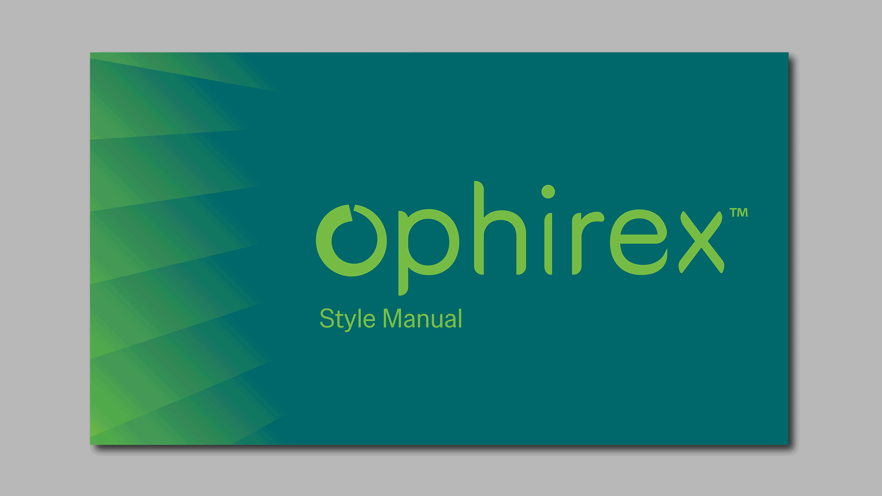
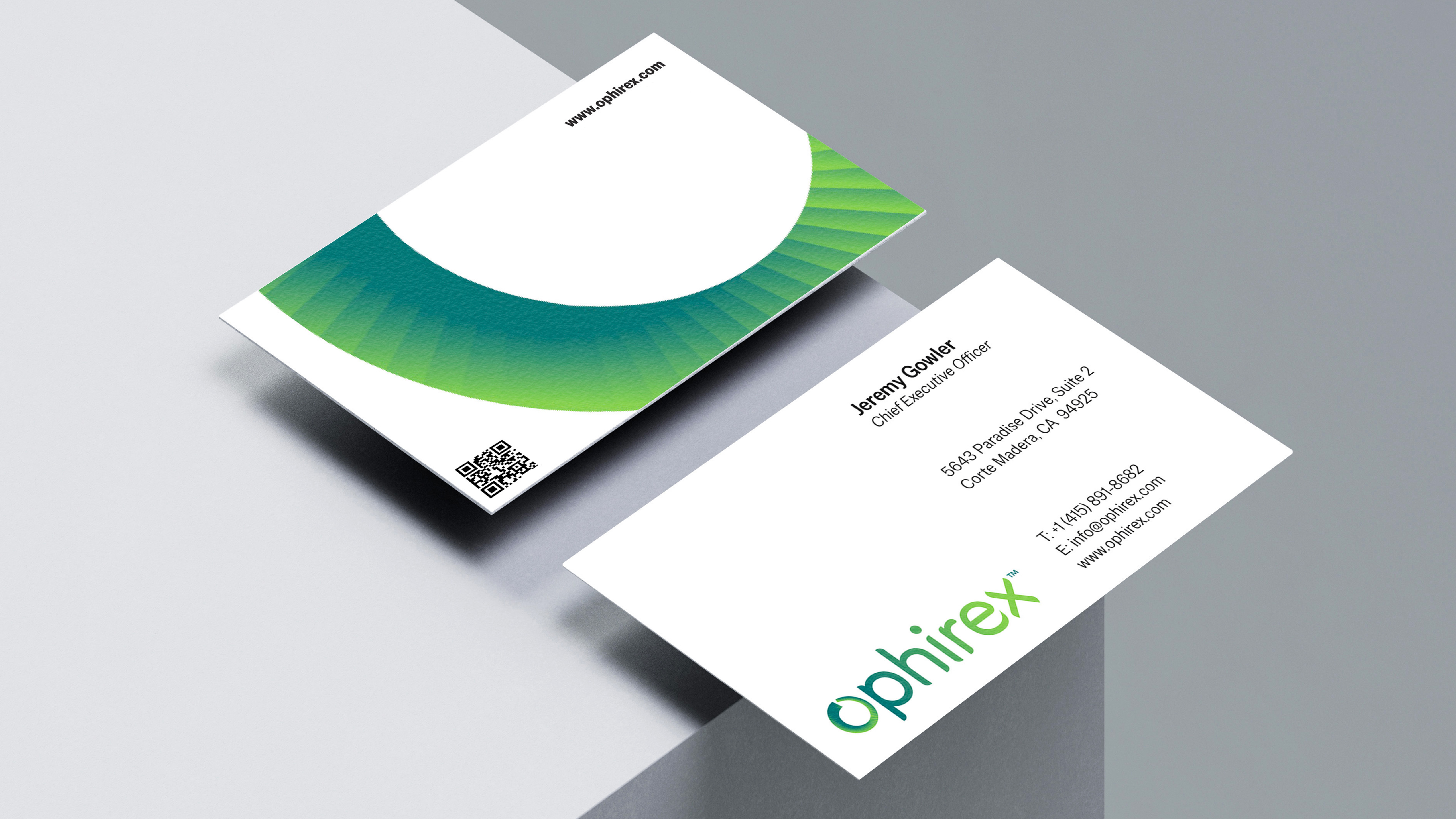
The new logo design is rich with intention and meaning. A subtle texture inside the “O” suggests movement and depth, while a teal-to-green gradient evokes the natural hues of snakes in their environment. The custom wordmark introduces nuanced shifts of green, echoing the snake’s ability to camouflage and stay hidden. The rounded, flexible typography reinforces the fluid, sinuous qualities of the reptile itself, creating a mark that feels dynamic, modern, and deeply aligned with the brand’s purpose.
The website extends this visual language by pairing essential scientific information with sweeping landscapes, places both breathtaking and home to dangerous venomous snakes—bringing the story of Ophirex to life with clarity and impact. View the Ophirex website here.