Canyon Naming and Branding
Canyon Opening 2026

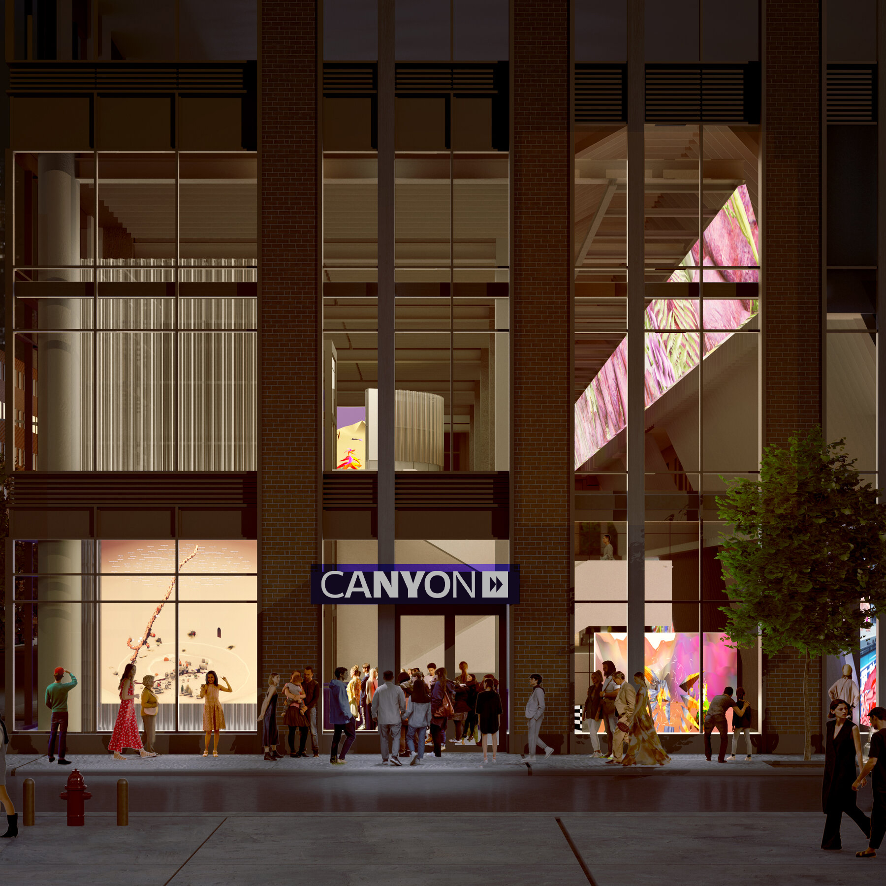
The name Canyon serves as a metaphor for time—formed over millennia, it reinforces the museum’s focus on time-based media. It also evokes a spirit of exploration, contemplation, and the rare opportunity to slow down and “pause” in the heart of New York City.
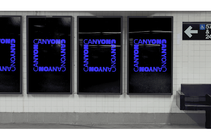
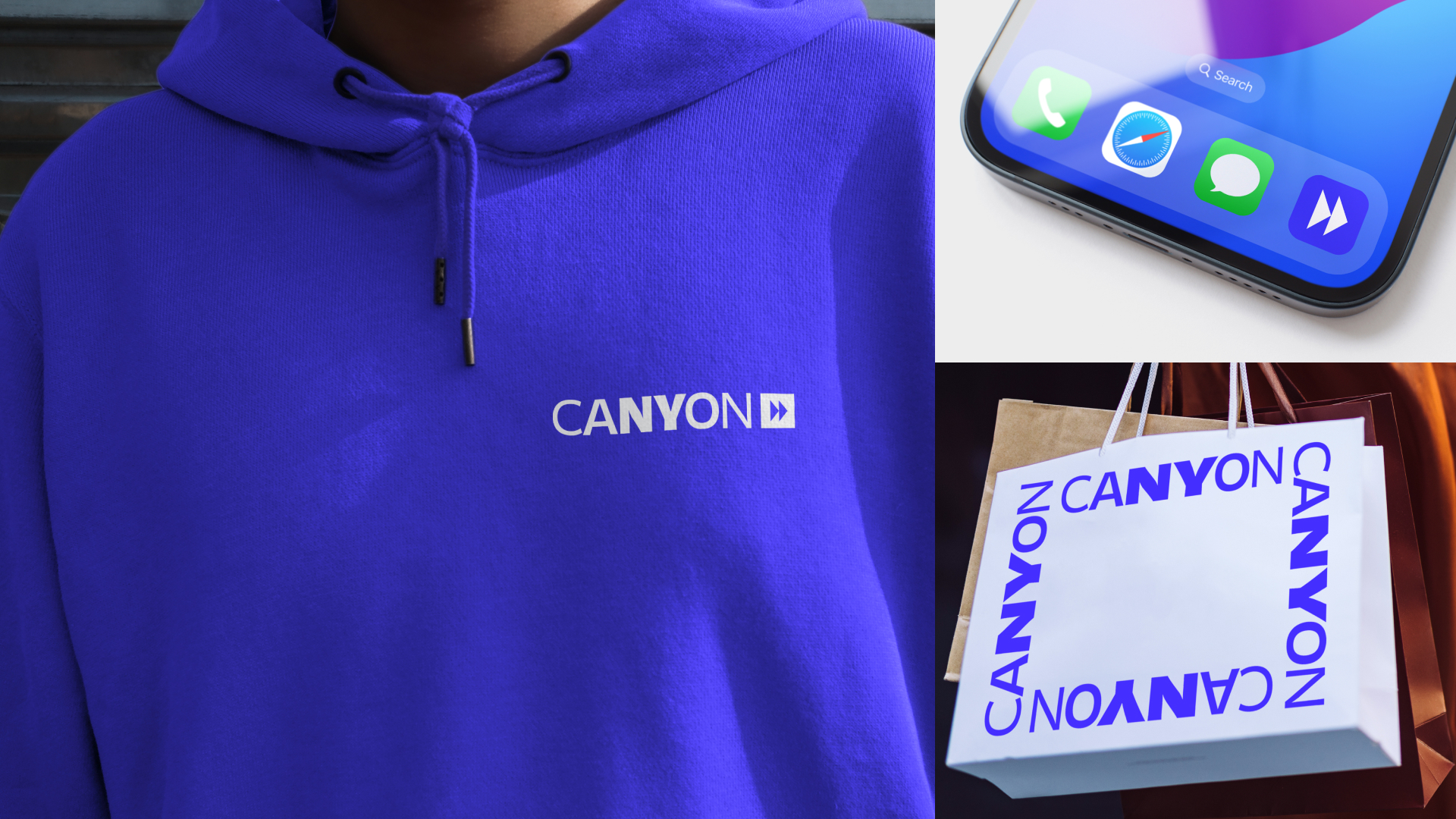
The logo exists in both vertical and horizontal orientations. The vertical version points downward, referencing the descent into the Canyon space. Designed for adaptability, the custom font stretches, contracts, and sometimes frames imagery. It dynamically responds to each exhibition’s energy and context while remaining legible and true to the brand.
See Canyon featured in The New York Times here. Can Video Art Bring Young Audiences to Galleries? A New Venue Hopes So.
ARTnews here.
artnet here.
HYPEBEAST here.
View their website here.
RELATED WORK
Arch Street Capital Advisors
Arch Street Capital Advisors Rebranding and Website
Odgis + Co
Discovering Your Brand's Value Animation