Brand Refresh
Brown Rudnick LLP

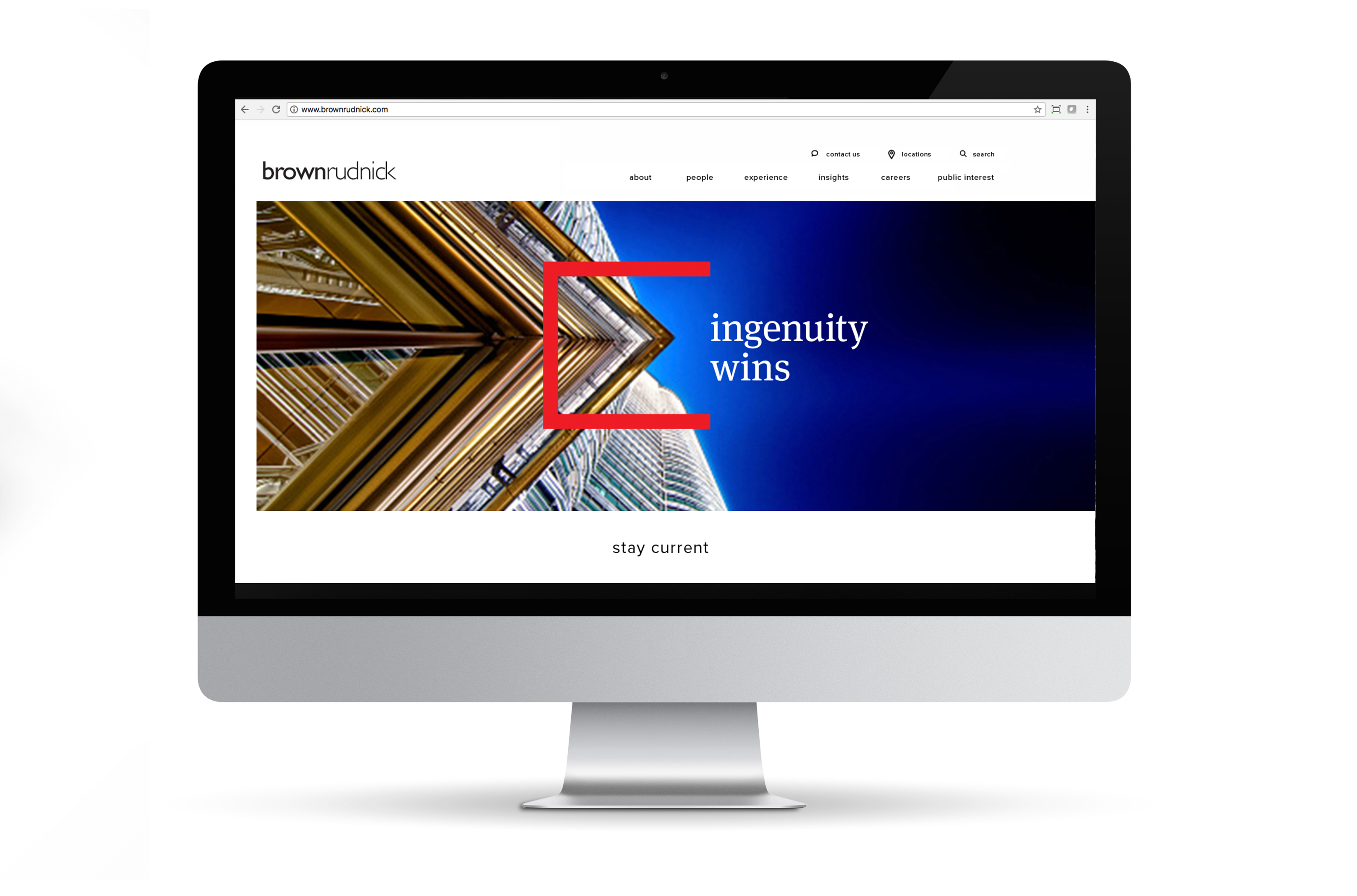
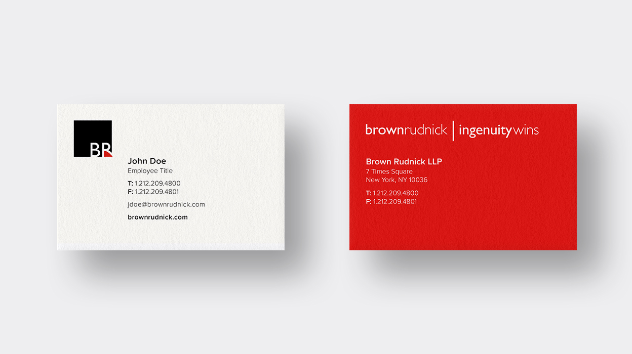
Odgis + Co refreshed the Brown Rudnick brand, redesigning their logo and all of its applications. We took a fresh interpretation of their existing mark and created a dynamic design system for print and web materials while preserving some recognizable elements of their legacy identity. The design system brought to life their new tagline, “Ingenuity Wins”, which conveys the firm’s ability to think outside the box to achieve great outcomes for their clients.
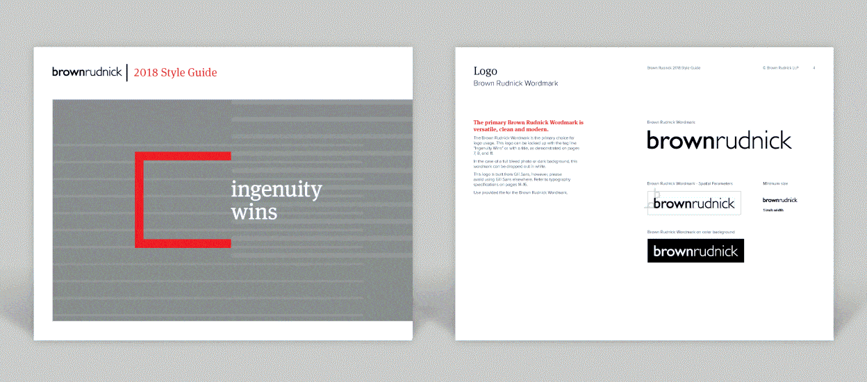
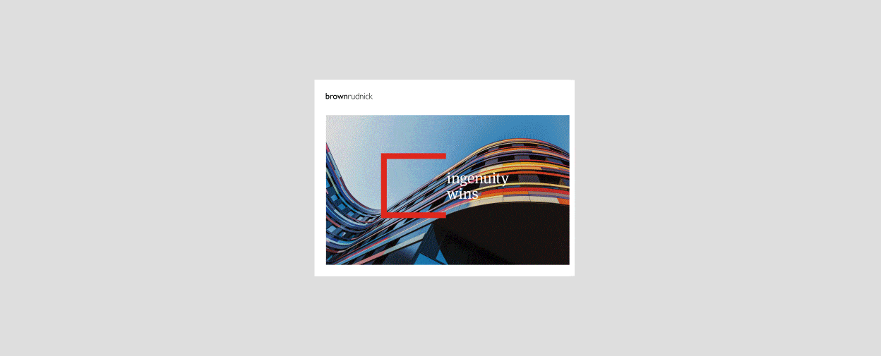
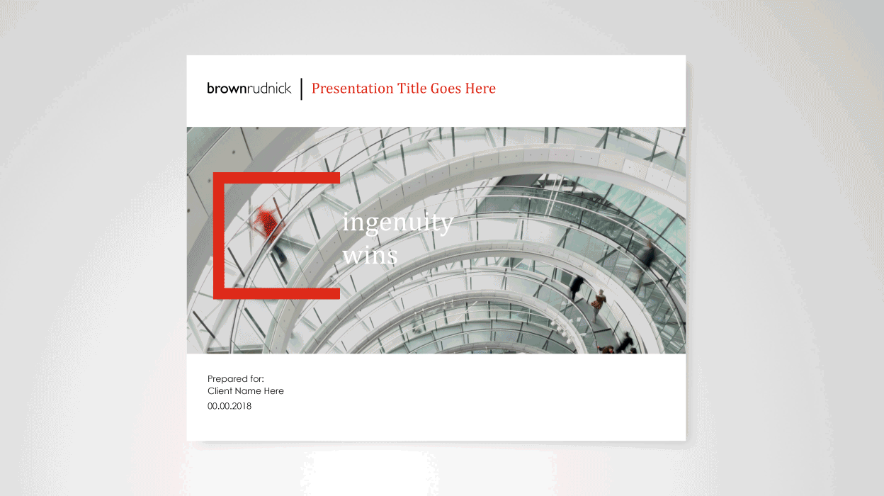
We integrated all the brand assets in a holistic system. We designed a comprehensive style guide, templates for pitches and presentations, brochures, alerts, and press releases. By creating key collateral materials as prototypes, we demonstrated its versatility in real situations.
Our goal was to make Brown Rudnick’s identity clean, modern and consistent on all touchpoints, creating an optimal and engaging brand experience.
RELATED WORK

Paul Hastings LLP
Impact + Sustainability Visual Identity
Wolf Popper
Wolf Popper Rebranding