Link Industrial Branding
Link Industrial Properties
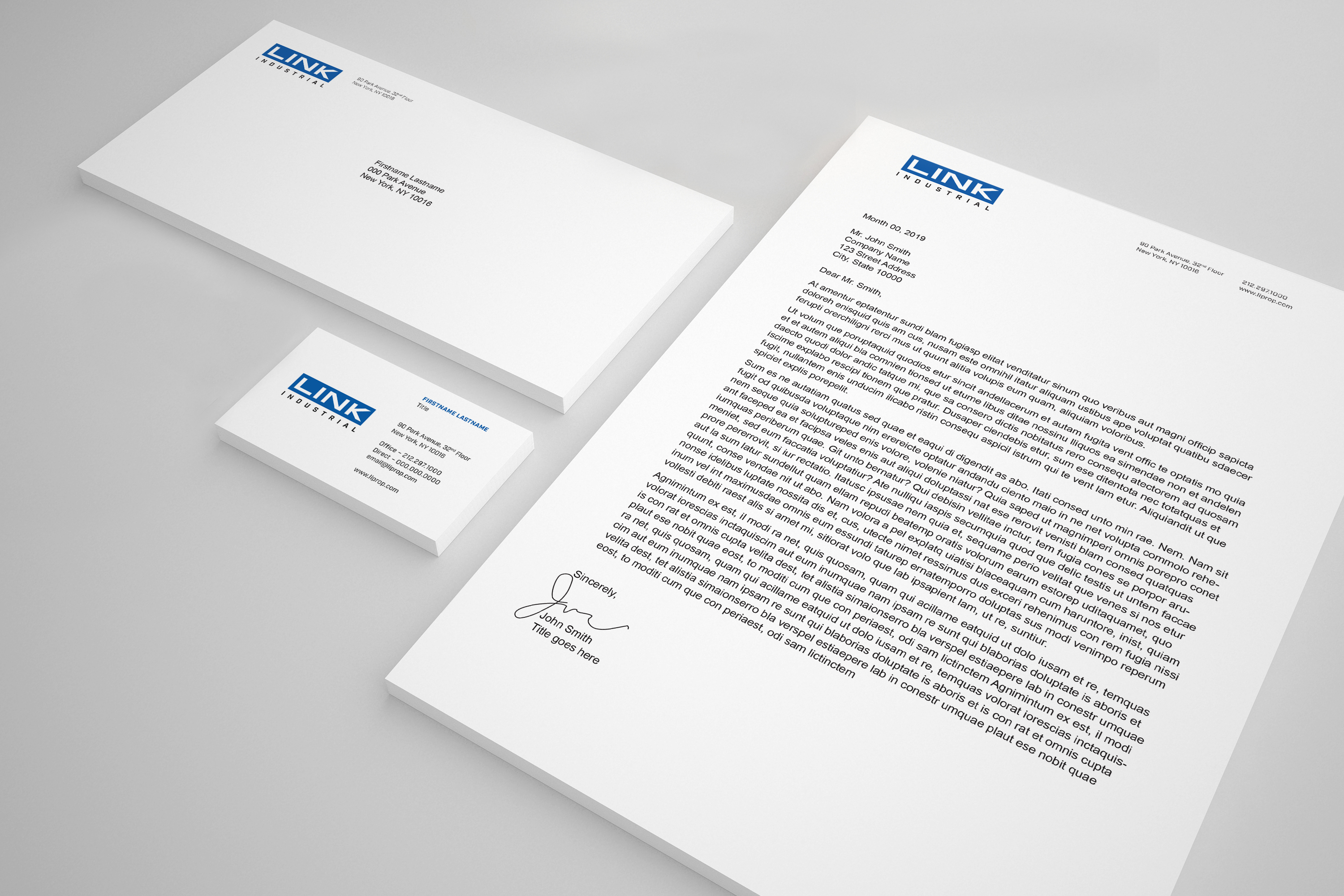
Odgis + Company initially designed the brand identity for Gramercy Property Trust, which was recently acquired by Blackstone and renamed Link Industrial Properties. We were once again asked to design a logo and visual identity for this new REIT that owns industrial properties. "Link" points to the company’s primary function as the warehousing and storage part of a supply chain. Link’s portfolio consists of enormous industrial buildings, lined with brightly colored industrial shelving and populated with a bustling system of shipping vehicles. The logomark reflects the forms of the buildings and colors present in their environment. The brand identity is bold, powerful, and very clean. In addition to the logo, we developed a Visual Identity Style Guide and entire suite of corporate materials.
Visit the Link Industrial Properties website >
Visit the Link Industrial Properties website >
"We’ve gotten great feedback on the new logo. Thanks for all the great work!"
Nicholas Pell, President and Chief Investment Officer | Link Industrial Properties
.gif)
RELATED WORK

Starwood Hotels and Resorts Worldwide
Vistana Signature Experiences Branding
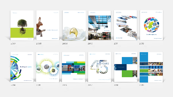
W. P. Carey
W. P. Carey Annual Reports