Designing Andy Warhol’s Book
5/12/2021Working with Andy Warhol
One of the loudest names in art history, Andy Warhol was arguably America’s most influential creators of the twentieth century. Widely known as a pioneer of pop art as a genre, Warhol was notably the most popular avant-garde artist of his time.
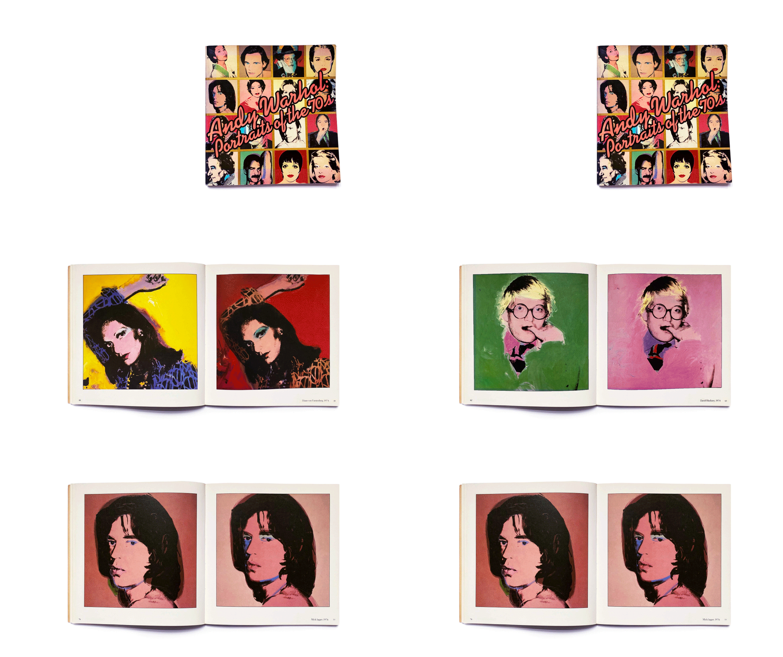
When Andy Warhol was at the peak of his popularity in 1979-80, the Whitney Museum was mounting a show called Andy Warhol: Portraits of the ’70s. At the time, I was a young Special Projects Designer at Random House and I was thrilled to be asked to design the book to accompany the show. With such a powerful living artist, how do you best present his art?
I soon realized that I needed to create a visual environment that displayed the art without impeding it. His silkscreens were square and done in multiples. Some aspects of the silkscreen were identical for all the portraits in the series and other aspects were uniquely colored.
Andy Warhol: Portraits of the ’70s Book Design Process
We decided to create a square book to echo the art, allowing a clean white area to frame each piece. We presented two of each portrait side-by-side on facing pages. The subject’s name was discreetly placed in the lower corner. Warhol’s work was energetic and loud, so I had to compliment it by being quiet. The design was basically invisible. The paper was coated but dull, so as not to distract. The essay by Robert Rosenblum was modestly placed in the front. The cover and binding were a big design opportunity. His office sent a sample of script outline typography they wanted us to follow when we hand-lettered the title. I used fluorescent pink/orange inside the title so that it would stand out from the grid of colorful portraits. A designer, like a good dance partner, will let the artist take the lead and will follow along with them. We also did a limited edition in a slipcase where I placed a monochrome black portrait of Andy on metallic paper.
At the Whitney opening of the show, throngs of luminaries gathered around him. I saw them holding our book waiting eagerly for him to sign them with a large felt-tipped pen. I wanted to say, “I designed that book you are holding.” Instead, I was smiling inside knowing I had helped create this object of desire. Sometimes the best design is the design you don’t even notice.
View the book here.
For those interested in Andy Warhol, Blake Gopnik recently published a biography titled Warhol.
By Janet Odgis
Read this article on LinkedIn
Odgis + Co is an award-winning brand design studio based in New York City. We Make Business Beautiful.


