Why Infographics Work
6/3/2021
In today’s information-heavy world, many businesses struggle to make sense of big data to their stakeholders. Financial reports, market research, surveys, and other assets containing an enormous amount of quantitative and qualitative data require extensive analysis in order to drive the most effective business decisions. Infographics condense large amounts of information into a form where it will be more easily absorbed by the reader.
Infographics are graphic visual representations of information, data, and concepts intended to present information quickly and clearly. This format distills and clarifies information and acts as the antidote to information overload. It can improve understanding to enhance our human ability to see patterns and trends.
Infographics can be created for the following reasons:
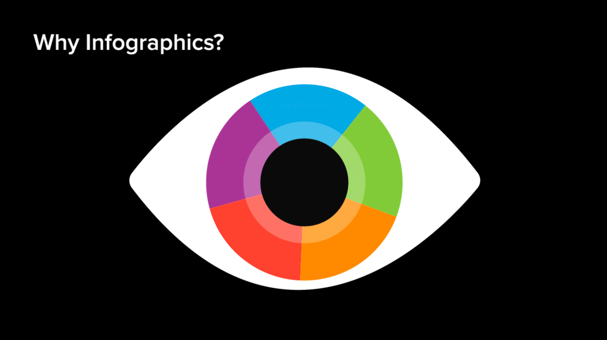
1. Illustrate data
2. Simplify a complex subject
3. Draw a comparison
4. Create awareness
5. Summarize the content
1. Statistical Infographics
As the name implies, statistical infographics present research, facts, and figures in a visual way. Carefully selected icons, charts, and illustrations create a coherent breakdown of demographics, psychographics, and other key takeaways.
2. Informational Infographics
This type of infographics has the ability to present information in a chart or graph, making it easy to access. This format creates a straightforward and memorable overview and can become an essential asset in branding.
3. Process
It is recommended to break down your process in the form of an infographic, explaining the different parts of and how it works. Your potential partners and clients grasp a better understanding of your business, resulting in greater confidence.
4. Timeline
Evidently, presenting information in chronological order creates clarity and fosters a deadline-oriented outlook.
5. Hierarchical Infographics
This type of infographics displays different levels of information and supports storytelling through data.
6. Lists
Organized numbered or bulleted lists summarize and present the organization of information in a familiar way.
7. Comparisons
With infographics, you can illustrate similarities and differences visually. It can be especially applicable in competition analysis or performance overviews.
8. Location-based Infographics
Geographic information can be more impactful when presented in a visual form for a location-based comparison or display.
1. Create something unique and different.
2. Figure out what the stakeholders need to know about you.
3. Create clean and compelling designs that make your point clear.
4. Less text, more visuals is the key.
5. Establish a visual hierarchy according to the level of importance.
6. Consider making it interactive to take it to the next level.
By Janet Odgis
Read this article on LinkedIn
Odgis + Co is an award-winning brand design studio based in New York City. We Make Business Beautiful.
Infographics are graphic visual representations of information, data, and concepts intended to present information quickly and clearly. This format distills and clarifies information and acts as the antidote to information overload. It can improve understanding to enhance our human ability to see patterns and trends.
Infographics can be created for the following reasons:
1. Illustrate data
2. Simplify a complex subject
3. Draw a comparison
4. Create awareness
5. Summarize the content
Types of Infographics
1. Statistical Infographics
As the name implies, statistical infographics present research, facts, and figures in a visual way. Carefully selected icons, charts, and illustrations create a coherent breakdown of demographics, psychographics, and other key takeaways.
2. Informational Infographics
This type of infographics has the ability to present information in a chart or graph, making it easy to access. This format creates a straightforward and memorable overview and can become an essential asset in branding.
3. Process
It is recommended to break down your process in the form of an infographic, explaining the different parts of and how it works. Your potential partners and clients grasp a better understanding of your business, resulting in greater confidence.
4. Timeline
Evidently, presenting information in chronological order creates clarity and fosters a deadline-oriented outlook.
5. Hierarchical Infographics
This type of infographics displays different levels of information and supports storytelling through data.
6. Lists
Organized numbered or bulleted lists summarize and present the organization of information in a familiar way.
7. Comparisons
With infographics, you can illustrate similarities and differences visually. It can be especially applicable in competition analysis or performance overviews.
8. Location-based Infographics
Geographic information can be more impactful when presented in a visual form for a location-based comparison or display.
Tips to Make You Stand Out
1. Create something unique and different.
2. Figure out what the stakeholders need to know about you.
3. Create clean and compelling designs that make your point clear.
4. Less text, more visuals is the key.
5. Establish a visual hierarchy according to the level of importance.
6. Consider making it interactive to take it to the next level.
Final Thoughts
Nowadays, everyone can feel overwhelmed with information. It’s easy to get lost in the clutter. To be relevant, make yourself known as efficiently and clearly as possible. It’s difficult to simplify complexity. It requires a lot of thought and iterations but if you don’t, no one else will do it for you. It’s a challenge and an opportunity that can’t be overlooked.By Janet Odgis
Read this article on LinkedIn
Odgis + Co is an award-winning brand design studio based in New York City. We Make Business Beautiful.